Windows 11 Review
$Free, www.microsoft.com
Table of Contents
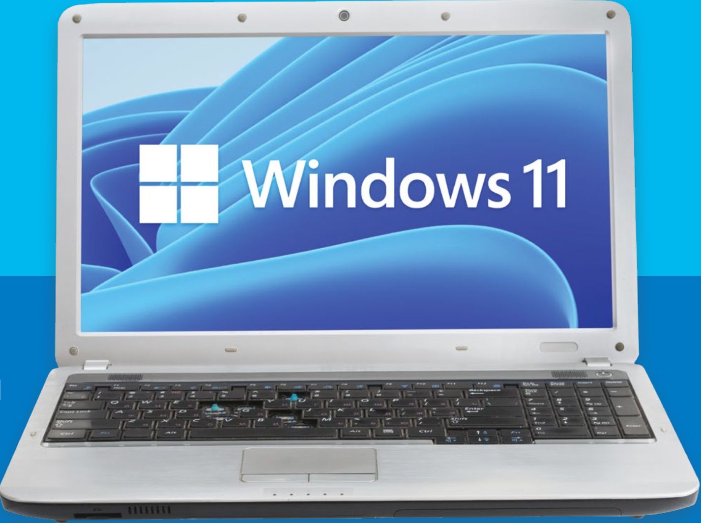
Windows 11 is finally here – which in some ways is surprising, as Windows 10 was heralded as the last ever update of Windows – one that would receive updates over the years, and eventually, decades.
Windows 11 is now available to download and install, and we’ve spent time with the final release for this review. There’s a saying that you either have to move with the times or the times moves you, however, which may be why we’re now seeing Windows 11, the first major update to the operating system in years.
Availability
Windows 11 is free for anyone who meets the system requirements set by Microsoft.
The upgrade arrives in two versions; Home or Pro. The Pro version has features mainly aimed at business users, but home users may like the fact that you can encrypt your hard drive with a tougher encryption level for better security.
However, most regular users won’t be missing out if they go with the Home version – every exclusive feature in Windows 11 Pro is tailored for a business, not the home, so if you use a PC for creative work or gaming, or just casual use, there’s little need for the Pro version.
While the free upgrade is welcome, the communication surrounding the system requirements in the run up to Windows 11’s release has been pretty woeful. TPM was once just a niche topic – but now it’s a major talking point, with many users still wondering if their PC is compatible.
A new requirement for anyone to access Windows 11 will be a Microsoft account and an internet connection. Without these, you’ll be stuck at the set up screen. While understandable from one perspective, it could frustrate others who just want to use a PC occasionally without having to create an account or constant access to an internet connection.
New Design
Microsoft made sure to mention in the June 24 announcement of Windows 11 that the user interface has seen a major redesign, which the company is calling ‘Fluent design’, the successor to the Metro design language that was first seen in Windows 8.
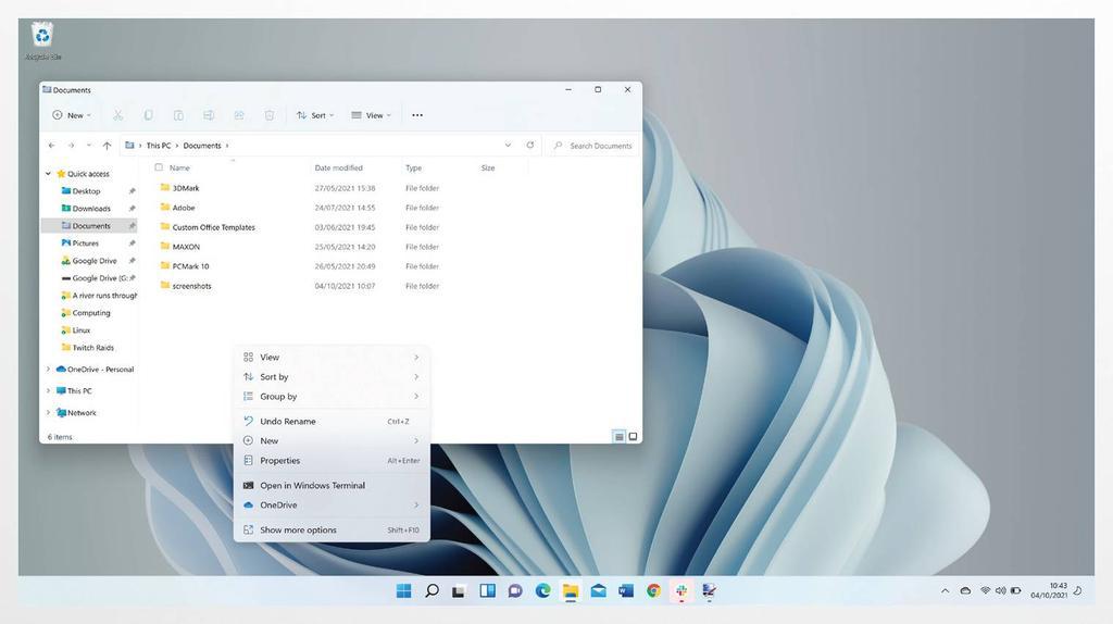
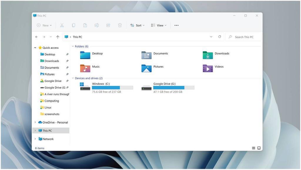
On first glance it looks great – everything appears modern and refined, and File Explorer has finally seen an update, alongside the context menus, both no longer looking like the fourth version of Windows XP.
But it’s only when you go deeper that the similarities to Windows 10 remain. For example, if you right-click in a folder and bring up the ‘Properties’ menu, you’ll find the same settings as before, but with rounded buttons and a new icon.
After a while it dawns on you: this is a reskin of Windows 10. While it’s a great step forward, more work needs to be done. Getting rid of the Ribbon interface in File Explorer and other built-in apps is a good start, as you now have ten icons on the toolbar instead of four tabs and countless settings found in Windows 10 and previous versions that used the Ribbon interface.
It’s one example of Windows 11 where it’s a great first step, there just needs to be a giant leap for more.
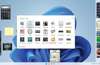
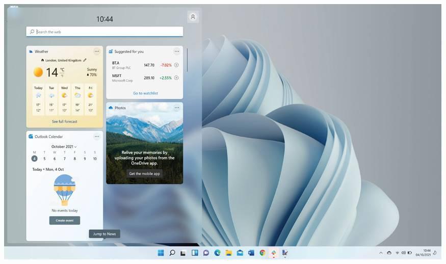
Gadgets are also back for Windows 11, but are now called ‘Widgets’. These are found in their own section, similar to macOS, so you can’t freely place them on your desktop. Swipe from the left-hand side of the screen brings them up, and they do their job for bite-sized information at a glance.
The only strange addition is the search bar in the widget window – it feels less like a widget and more of a shortcut to make you use the Bing search engine.
We also noticed that adding work accounts to a Calendar widget doesn’t work, but Microsoft tells us that it’s aware of this, and a fix is incoming.
Accessibility
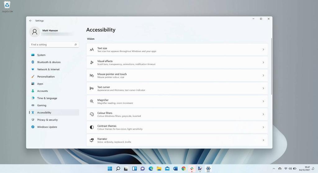
A big plus for Windows 11 is a new focus on Accessibility. It’s called ‘Accessibility’ instead of ‘Ease of Use’, which paradoxically could be a confusing name, but that’s just the start for Windows 11. New options for audio alerts for visually-impaired users can now notify when a message box appears, an update is available, and much more.
Voice Typing can also aid other users in being able to transcribe voice to text, whether that’s for the Edge address bar or when composing an email. There’s also better support for magnification programs, speech commander apps and screen readers as well, though not all of those will be supported at launch.
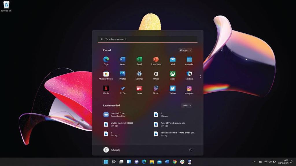
Let’s get to the point – the new Start menu in Windows 11 needs work. It feels half-finished, as if it’s a stopgap between Windows 10 and a touch interface designed for the new Surface tablets.
Visually it looks great, but once you dig deeper, the issues begin to reveal themselves. Everything is centered, with your apps being displayed, followed by a ‘Recommended’ section. This is a strange placement, which shows your recent files and apps but you can’t clear the list. When you click ‘More’, it’s just an expanded list with a date and the location of the files.
Also, when you try to search for something, it launches the Search app, which is a bit jarring when it switches between this and the Start menu. It lacks the unification of the Windows 10 Start menu, when you would try to look for something and the results would appear in an instant. It feels half-baked and slower than before.
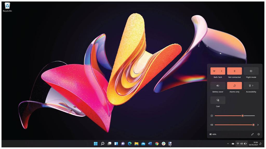
Another point is the Taskbar itself, where the new default location for the Start menu and the icons is the middle. Again from a usability perspective, it makes sense if you’re using Windows 11 on a tablet device, but with a mouse, it doesn’t make sense, and you’ll most likely want to switch this back to the left (which, thankfully, can be easily done through the Settings app).
However, while there’s promise here, it needs refinement. Hopefully, once Windows 11 rolls out to everyone, feedback will convince Microsoft that the new Start menu needs another look. Perhaps this design can work for tablet mode as a starting point, and when using devices that don’t have a touch display, the icons and Start menu can revert to their original placement and in a way to make it more accessible.
Microsoft has told us that they’re taking notice of the Feedback Hub, an app where it shows users’ recommendations for Windows 11. There may be more changes to the Taskbar and Start menu in the coming months.
Built-In Windows 11 apps
One common theme across Windows releases has been the lack of love given to the built-in apps, such as Paint, Snipping Tool and more. But in Windows 11, they’ve all been refreshed and updated, which is sure to please many users.
The aim for these looks to be a design that suits both a mouse and touch input, and for the most part it succeeds for these apps. Paint is fun to use once more, while Snipping Tool is finally the only app to control how you crop apps and save them as an image.
Clock is a surprising app to be redesigned here as well. Now, it’s where you can manage your time to do work thanks to ‘Focus’, a feature similar to one of the tentpoles of Apple’s iOS 15 update, where Focus allows you to create profiles that can be automated depending on your calendar, location and more.
Each of these apps finally looks unified with Windows 11 – there’s no mix of Fluent Design and Metro design, something that Windows 10 suffers from. Everything looks refined, which is great to see from Microsoft.
Microsoft Store
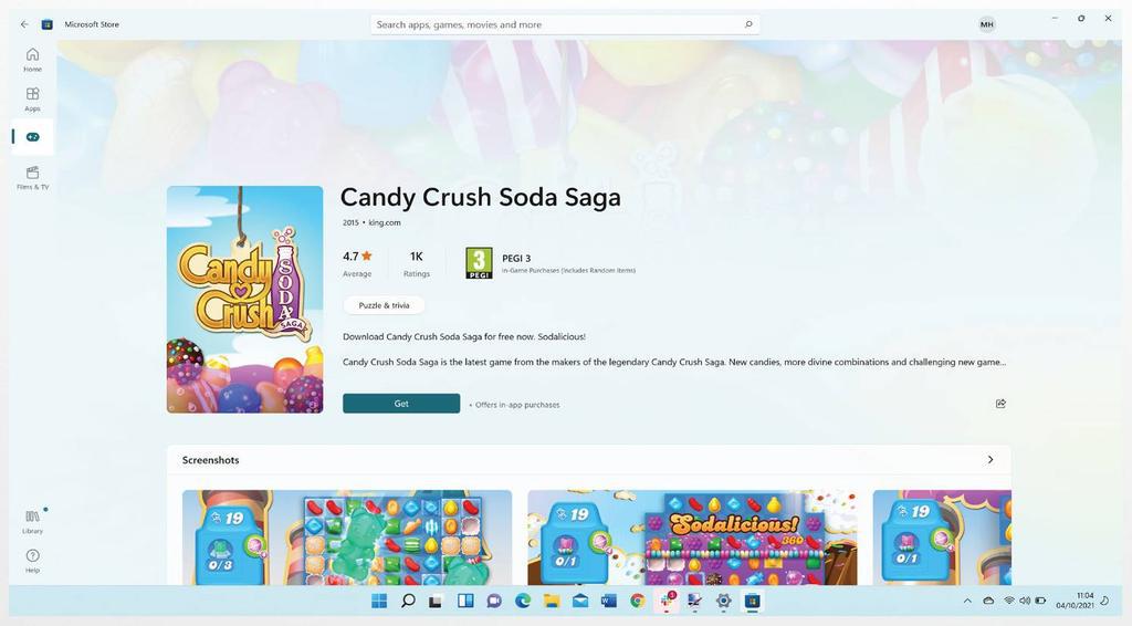
Another big tentpole of Windows 11 is the redesigned Microsoft Store. It’s no secret that it has felt a little neglected in Windows 10 recently. But, the new Microsoft Store looks to be a place where apps and even third-party stores can be accessed securely and without fear of malware.
The design of it is simple enough, with a search bar at the top with instant results, alongside three categories to choose from on the sidebar to the left.
For new and novice users it’s a great storefront to easily find apps, and it’s a credit to Windows 11 as it’s going to be a big timesaver for many people, especially those who have got a new PC and want to quickly and easily download essential apps.
While it was announced that Android apps from the Amazon Store will be arriving at some point, it looks like we’ll have to wait until a future update in 2022, enabling users to install apps such as TikTok, Instagram and more.
Other Windows 11 features
There’s other features exclusive to Windows 11 apart from the new Fluent Design refresh, Accessibility and the Microsoft Store.
When you first start up a PC with a fresh install of Windows 11, you’ll be given the option to move files and your desktop from OneDrive, similar to the Migration Assistant from macOS. It’s a very welcome feature that’s going to help a lot of users, especially as it can relieve the stress when setting up a new PC for the first time.
There’s also a new way of managing different apps that are open called Snap Groups. While this is more aimed towards touch screen devices, it’s a much improved variant on the snapping of windows that was first introduced in Windows 10, and makes it much easier when managing a multi-monitor setup.
In-tandem with this, better multi-monitor support arrives in Windows 11, where the upgrade will remember where certain apps were placed if you disconnect a laptop from an external monitor, for example.
Gaming on Windows 11
In the past, gaming on Windows has had its fair share of ups and downs, from Games on Windows Live to the barebones Xbox app in Windows 10. But, Microsoft has made sure to make gaming a tentpole of Windows 11, with the Xbox app now built-in and more tightly integrated.
Better HDR support for games, plus Auto HDR for making non-HDR games look better when it comes to contrast, has also been added, which is very welcome indeed.
Final words
This is the first release of many to come for Windows 11, and based on what it brings, it’s a fantastic start. Fluent Design is a great successor to the Metro look that’s been prevalent since Windows 8, and it brings the style and colour scheme of Windows to the modern age.
However, the redesign often feels like merely a reskin of Windows 10 at the moment regardless of a change in buttons in Explorer, Paint, Snipping Tool and other apps. As soon as you go deeper, you’re looking at the same features as before, but with rounded corners and a new icon.
Meanwhile, an improved Microsoft Store is something that was needed for Windows, and it’s very easy to use. Alongside Android apps coming soon from Amazon, it’s going to be a great starting point for casual users who want to find their apps more easily.
For now though, while it’s a great start for Windows 11, it’s time for Microsoft to go deeper and look to refine how other apps, such as Disk Management and even Notepad, can work in Windows 11. If you use a PC occasionally, you’re going to enjoy Windows 11, but for anyone who uses it for work or gaming for more than eight hours a day, you may find it’s just an incremental update – but that may not be a bad thing either.
The Windows 11 operating system will be remembered for bringing Windows to the modern age, thanks to its updated design and better ways to discover and download apps. But deeper improvements remain to be made in future releases, such as clarifications on system requirements and making Fluent Design more than just a reskin.
When you purchase through links on our site, I may earn an affiliate commission. Here’s how it works.


