Swapping out Xfce’s window manager for elementary OS’s proves most pleasing to hybrid fan Jonni Bidwell.
SPECS
A lightweight, Xubuntu-based distro aimed at beginners and those using older hardware. It utilises the Gala window manager for a different take on the Xfce desktop, featuring the Plank dock and global menus. See also: antiX, elementary OS.
We’re fans of both elementary OS and Xfce, so when Enso OS popped up on our radar our curiosity was duly piqued. Enso makes use of Gala, elementary OS’s window manager that together with the Plank dock (also used in elementary) gives the Xfce desktop a polished, modern look.
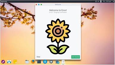
Indeed, at first glance it’s barely recognisable. Enso doesn’t use the rest of elementary’s Pantheon desktop, so it doesn’t immediately resemble that either, beyond having a similar air of svelte about it. When you boot the live environment a friendly screen (pictured, right) welcomes you to this Singing
Sunflower release. If you click through to the menu you can change user details (which isn’t really relevant for the live environment), access settings, launch the software manager, and visit the online documentation and Gitter chat room.
The Plank dock is aligned to the bottom-left which (since there aren’t many shortcuts or running programs) might upset some people’s sense of symmetry. But on the plus side this affords you an unobstructed view of the bottom-right part of the desktop wallpaper, which by default is a rather fetching blossom against a peachy sky.
The start up and shut down screens use a similarly pleasing palette. Icons in the dock use the bold Paper theme, and striking, filled circle window decorations (styled with a fork of the Arc theme that helpfully reveals the close, minimise and maximise functions when you hover) adorn the left-hand side of each window. The busy cursor is some sort of spinning beachball. It’s a little like a

Singing sunflowers and peach blossom sunsets are some of the things we think about when our code won’t compile. After all, harsh language isn’t nearly as pleasing on the eye
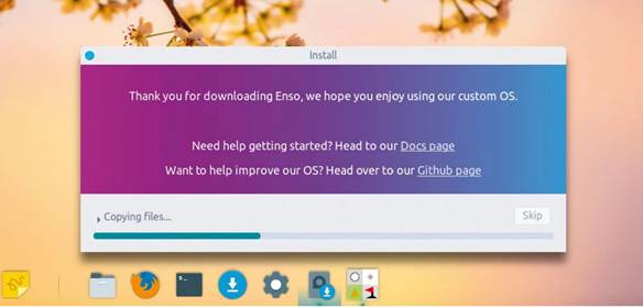
installation uses Ubuntu’s Casper installer and is swift and colourful.
certain fruity OS, we’ll admit. There are some neat fade effects too, but they don’t seem to be overly taxing on system resources.
Born out of enthusiasm
Enso uses the stock Xubuntu installer, so we don’t envisage any problems installing alongside other distros. A pulsating colour gradient entertains you for the five minutes it takes to complete the installation. Enso seems for now to be a one-person distro, so we wouldn’t necessarily recommend it for beginners and certainly not production machines. But stalwart developer Nick Wilkins has been nurturing the project for three years now, and there are no indications this enthusiasm will fade.
Firing up the terminal (the default Sakura tool from Xfce) post-install, we were pleased to see it making use of transparency. Depending on which windows are behind this though, it might prove distracting or otherwise affect
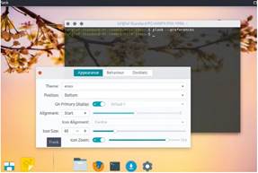
If you brave the terminal you can access a nostalgic icon zoom effect. And for some reason the dock spacer is called Frank.
readability, but it’s easy to turn off or increase the opacity a smidgeon. The initial install occupied nearly 6GB, which is rather on the heavy side for a lightweight operating system. However, space is cheap, and a clean boot left only about a 600MB memory footprint.
What makes Enso OS stand out is its use of a global menu. Despite Ubuntu’s best efforts in the Unity days, and despite its success on macOS, these have never really caught on in Linux. Penguinistas, it seems, like their applications’ menu bars to live inside the windows of those applications. We like the idea of less clutter in our windows, and we don’t mind having to send the cursor far off to access lesser-used menu options.
We found a couple of things clumsy about Enso’s global menu, though. The first is that the foreground application’s title is displayed in the top-left corner. This is fine, except when there’s no foreground application. When you log in to the desktop, the global menu has shortcuts to the Settings tool and Documents folders. Handy enough, and a better use of space than Gnome’s top bar. However, when certain running programs are closed there seems to be a bug in which they don’t rescind their global menu occupation, and the only way to regain the original menus is to open and close a program that better tidies up after itself. The stale menu has the side-effect of making it appear like the previous application is still running, which it isn’t. Applications that don’t have global menu support show a singleton menu bar with New and Quit options, which makes that menu bar guilty of at least some of the crimes Gnome has purportedly committed.
Enso has its own AppHive application installer, a fork of elementary’s AppCenter. It’s lighter than the standard Gnome affair and supports deb and Snap packages.
Minor niggles
There are a couple of places where Enso OS still feels rough around the edges. For example, there’s no shortcut to the Plank preferences dialog. This is a shame because some users may enjoy wistfully gliding the cursor across the dock with the icon zoom effect activated. If you want to do this you can open Plank’s preferences from the terminal.
Another niggle is the occasionally inconsistent theming. The shutdown dialog looks exactly like it would in Xubuntu, it would look much better with some more of the bold, Paper icons used to such good effect elsewhere. Oh, and there’s a stray, broken option to load an Xfce session from the (otherwise lovely) greeter. And if you hover over the separator in the Dock it says Frank…
But let’s not dwell on the minutiae. There are some neat touches too, including that login screen and the handy notes tool, Pinny. The documentation covers installation and introduces the desktop in a clear and reasonably thorough way. Then there’s a short section that covers more general Ubuntu topics. It’s an accessible five-minute read, and we’re pretty sure the Xubuntu documentation will cover anything else that comes up. If not there’s a small but active community who you can ask nicely for help in the chatroom.
VERDICT
DEVELOPER: Nick“nick92” Wilkins
WEB: https://enso-os.site
LICENCE: Various
» LAUNCHY KEEPS THINGS SIMPLE
Application menus are a terribly subjective thing. Dislike for modern, full-screen application menus such as used by Gnome is a matter of public record. Even elementary’s lovely menu is not to everyone’s taste, or if it is then the need to press two keys to open it is not.
In the previous release Enso shifted from a fork of elementary’s Panther Launcher to its own offering, dubbed Launchy. It’s traditional in the sense that there are categories on the right, but traditionally where you have a menu button the expectation is that the menu will appear somewhere near to that button, not pop up in the middle of the screen. But that’s Launchy’s way. This probably isn’t jarring if you summon it, traditionally, with the Super key, but the first few times you click the button it feels like the mouse cursor has to make a slightly unnecessary journey.
Launchy features instant search typing – de rigueur for modern desktops. But aside from enabling you to search the web (using the tree-friendly Ecosia search engine) there’s not much else in the way of features. Which makes perfect sense for a lightweight distro.
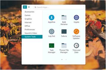
Fans of compact launchers such as Krunner and Drun will appreciate Launchy’s stylings.


